Haarpaleis
Branding
Identity
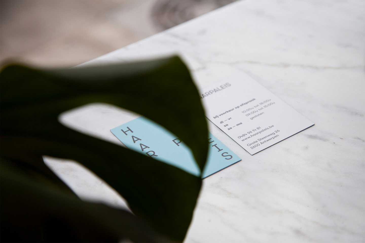
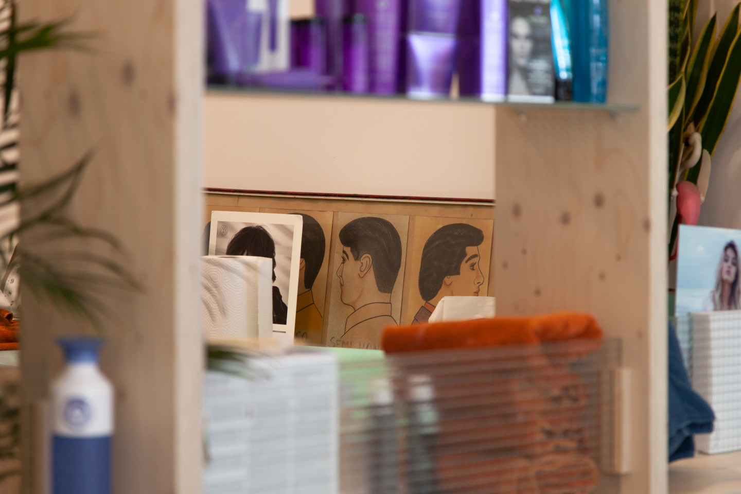
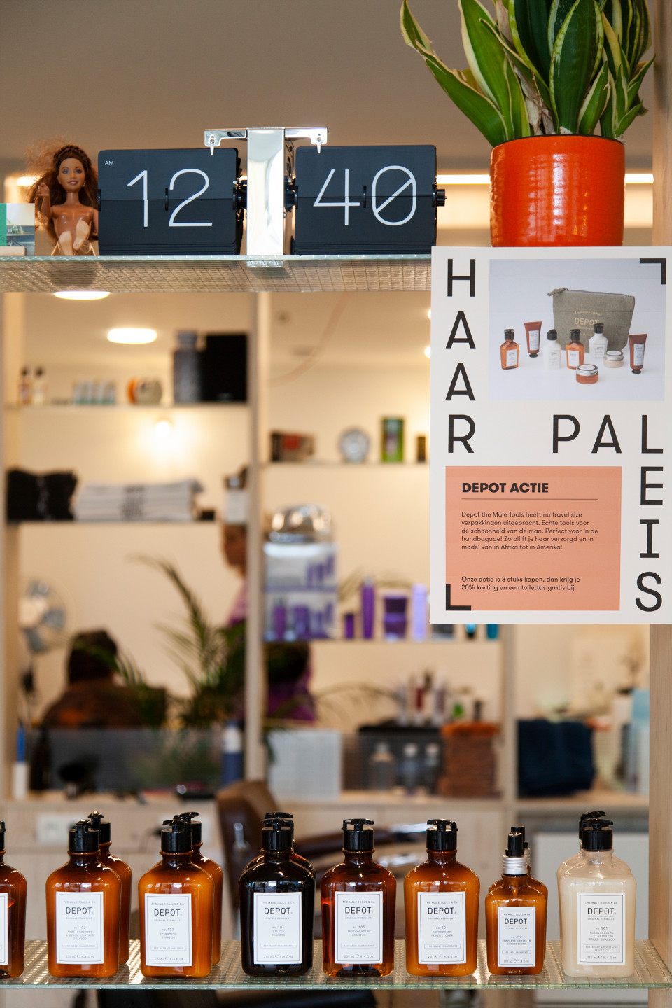
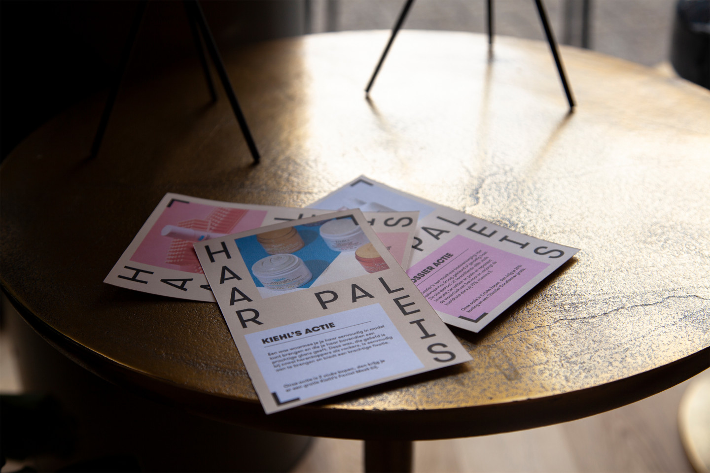
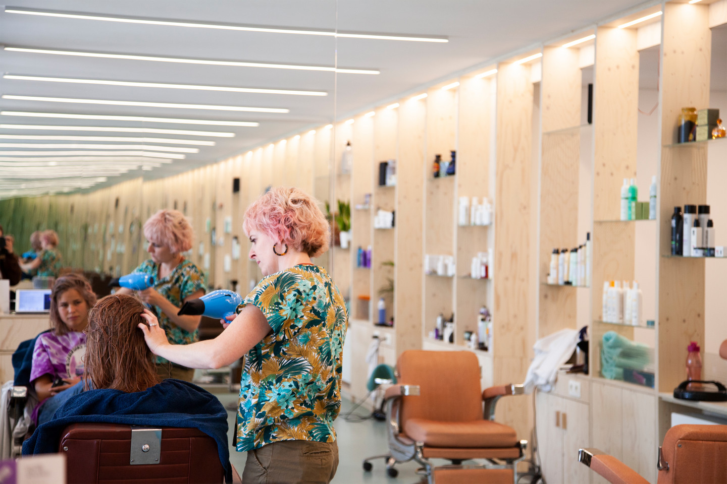
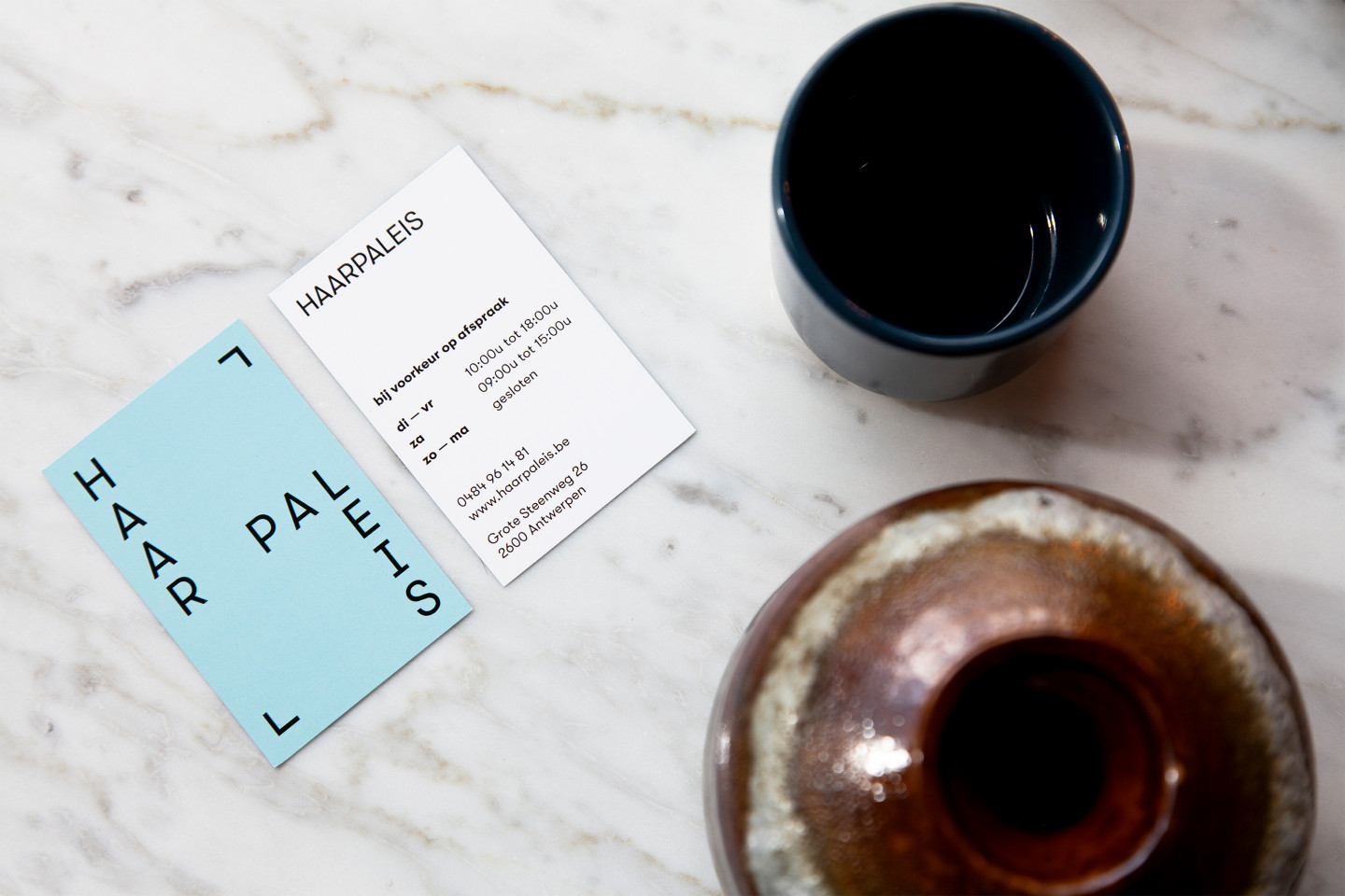
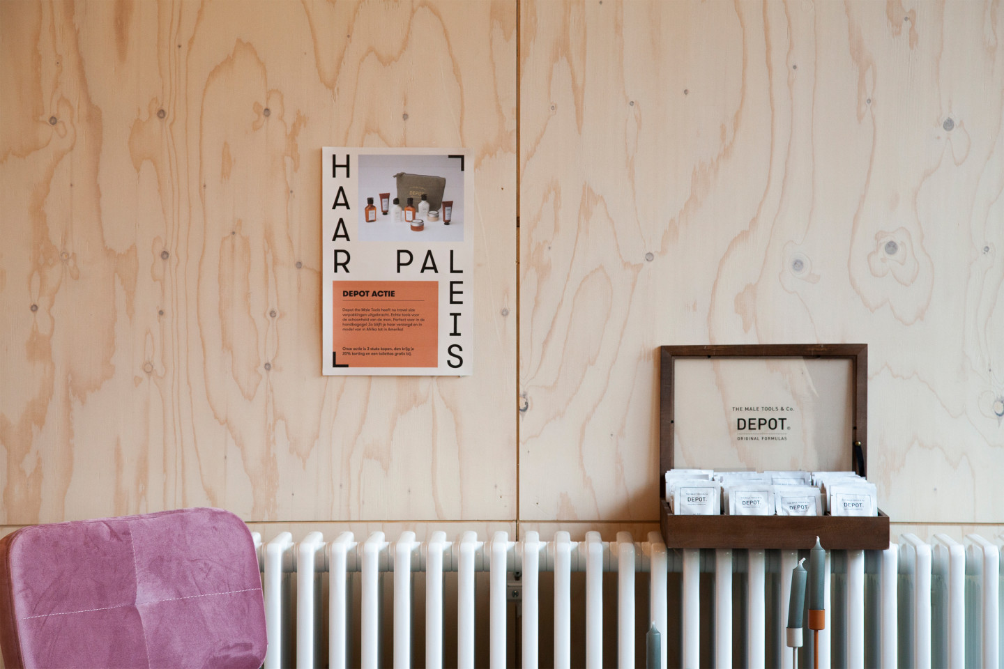
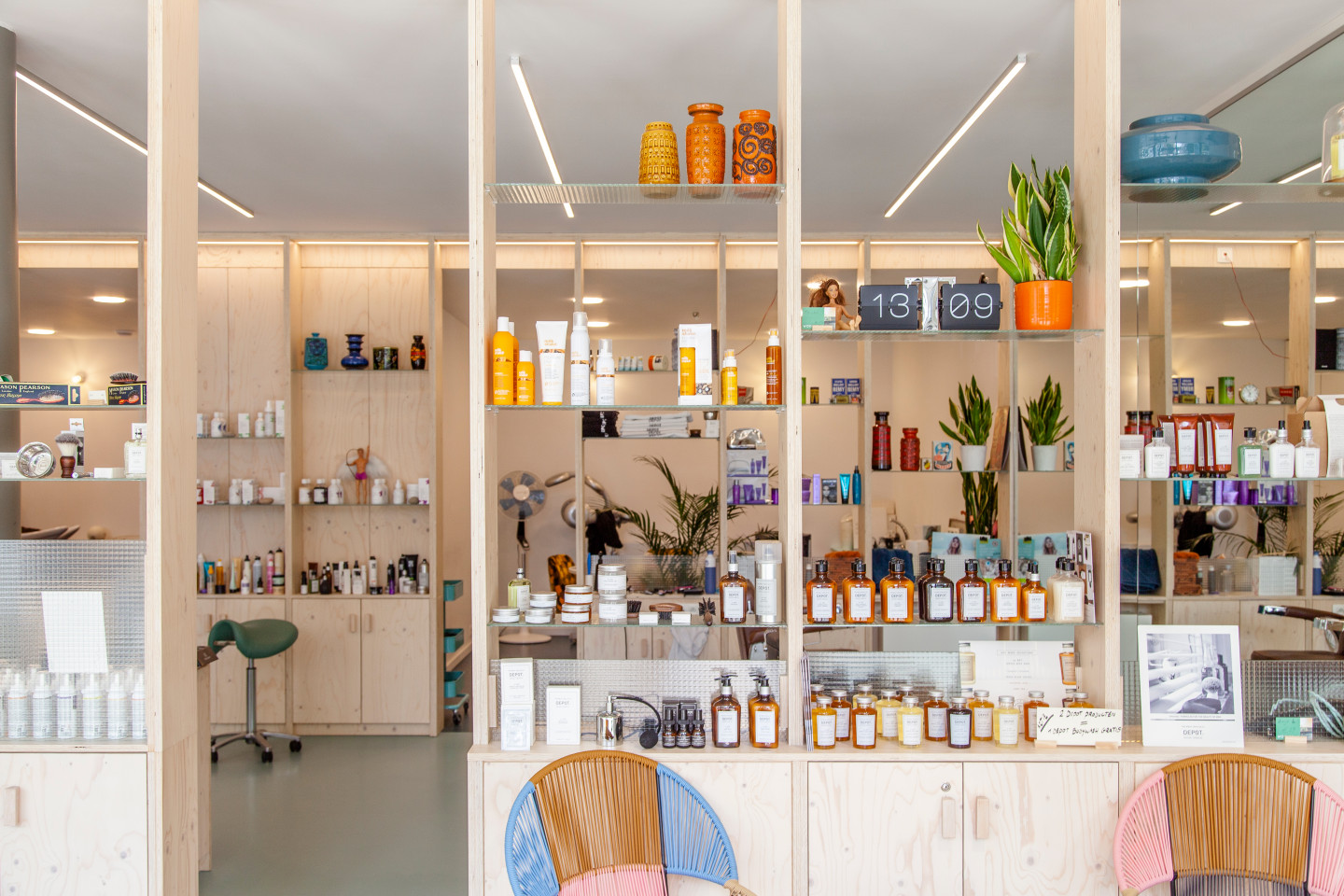
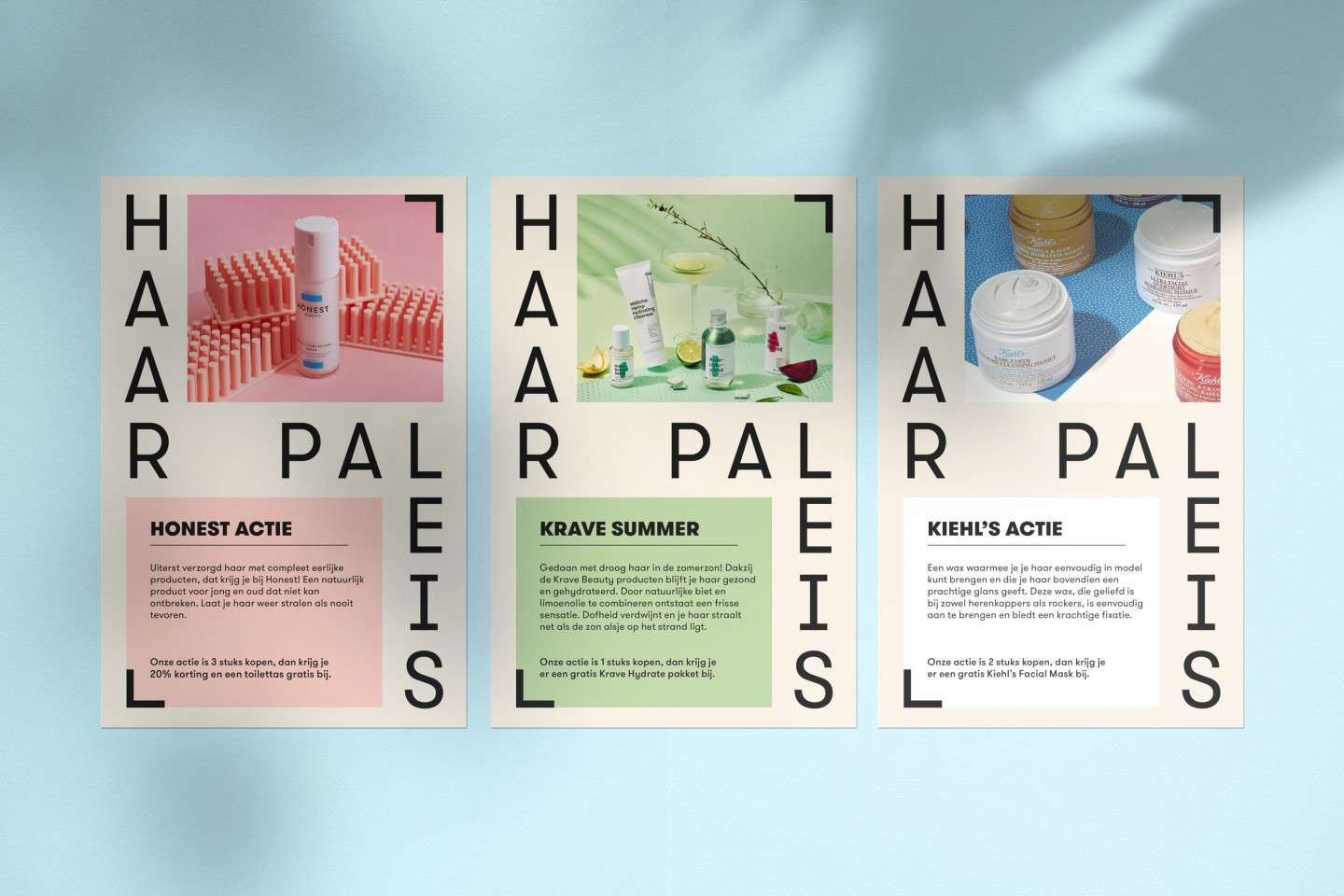
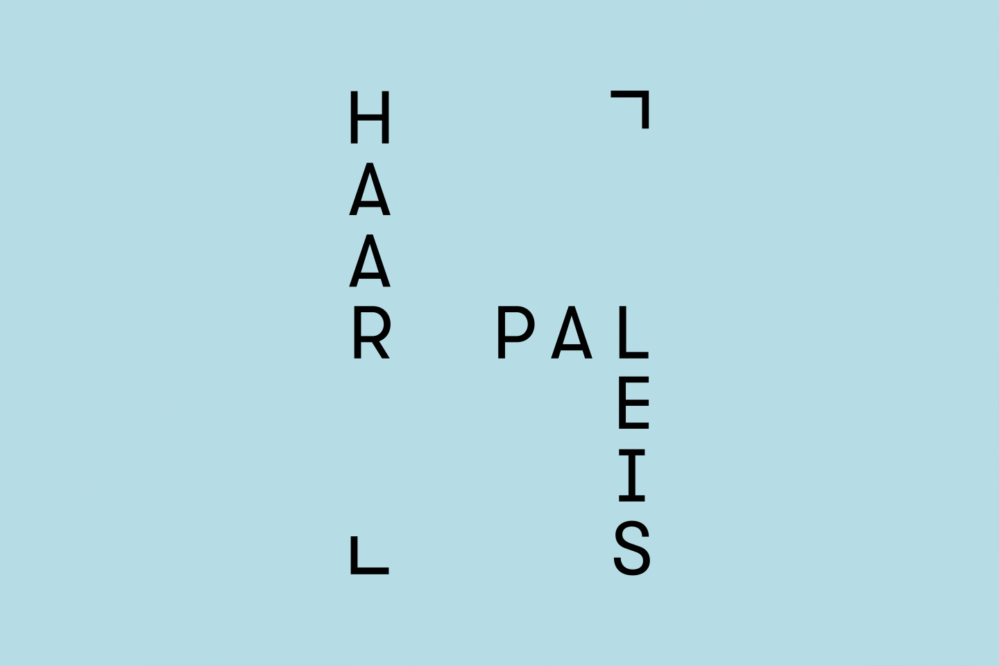
Haarpaleis was created in 2009 out of passion for hair, color and lifestyle. From a living room atmosphere they come to a contemporary and creative cut or color. We use a characterful but somewhat retro font in a contemporary way. This ensures that the vibe of the Haarpaleis is perfectly translated into identity. The logo is structured so that it forms the basis for posters with which they announce promotions. Thus it is clear that the promotion comes from them and not from the supplier.
Warm pastel shades that complement the interior form the basis of the color palette. This can be combined endlessly with the purposes. However, the blue color is central as a reference to the previous building and a characteristic of the store, their blue floor.
Photography: Erine Wyckmans